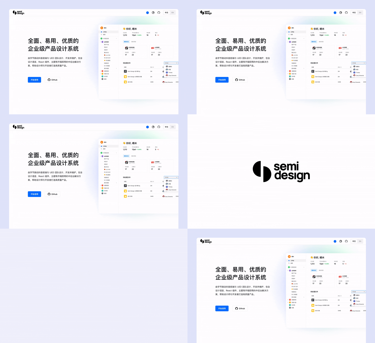
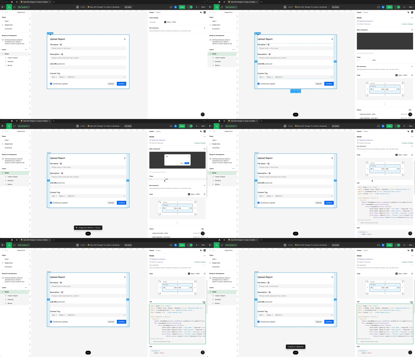
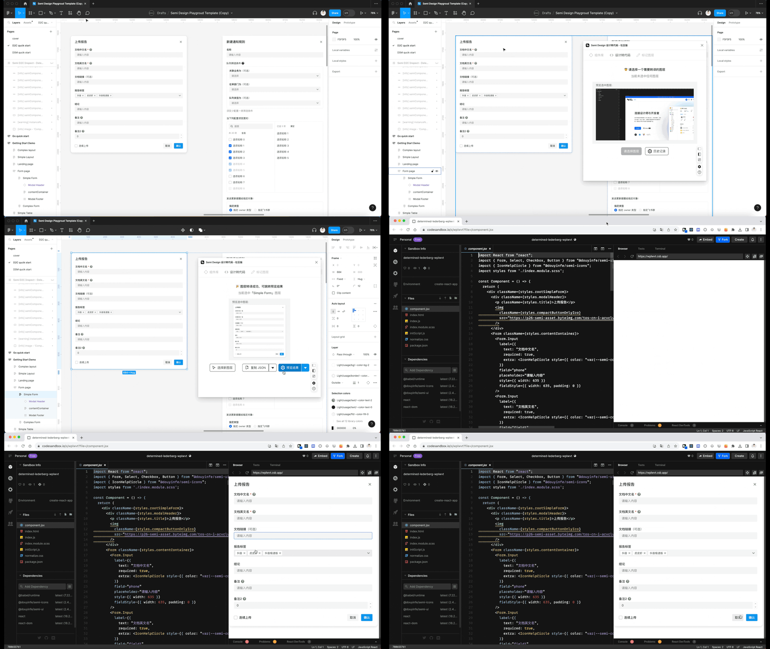
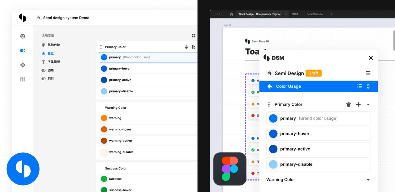
🚀A modern, comprehensive, flexible design system and React UI library, AI-friendly built-in.🎨Provide 3000+ Design Tokens, easy to build your design system. Make Semi Design to Any Design.🧑🏻💻 Design to Code in one click
10.1k
Stars
820
Forks
28
Open issues
30
Contributors


AI Analysis
Semi Design is a comprehensive React UI library and design system with 80+ components, offering bidirectional Design-to-Code (Figma to React) and Code-to-Design (React to Figma) capabilities. It serves teams building consistent, theme-able applications who need both production-ready components and design system tooling; best suited for enterprises and design-forward organizations rather than quick prototypes.
Inferred from signals mentioned in the README (tests, CI, type safety) — not a review of the actual code.
AI's overall editorial judgment — not an average of the bars above, can weigh other factors too.
ByteDance's Semi Design brings 80+ React components and deep Figma-to-code tooling to enterprise UI development
Semi Design is a React UI component library and design system originally built by ByteDance (Douyin/TikTok's parent company) for internal enterprise product teams. It offers 80+ components, 3000+ design tokens for deep theming, a Figma plugin for design-to-code conversion, and a Design System Manager (DSM) for keeping Figma and code in sync. Its primary audience is teams building complex, themeable enterprise web apps in React who want tight design-developer workflow integration. The project has been in active development since at least 2019 internally and open-sourced in late 2021.
Originally developed internally at ByteDance for enterprise product tooling, Semi Design was open-sourced in October 2021. It has evolved from a standard component library into a broader DesignOps platform with D2C and C2D capabilities.
The project reached 10K stars over roughly 4.5 years, driven primarily by Chinese enterprise frontend teams and ByteDance's brand recognition. Growth has been steady but not explosive — 32 stars in the last 7 days suggests a stable, slow-growth phase rather than viral momentum. The addition of AI-friendly and D2C features in recent versions likely attracted renewed interest from teams exploring AI-assisted UI workflows.
Semi Design is documented as being used in production across ByteDance's internal enterprise products since 2019. External adoption by non-ByteDance teams is not directly quantified in the README, but 10K GitHub stars, 816 forks, and a mature npm package (@douyinfe/semi-ui) suggest meaningful external usage, particularly in Chinese enterprise frontend teams. Adoption outside China appears limited based on available signals.
Appears to use a Foundation/Adapter pattern (explicitly mentioned in README), which likely separates core logic from rendering concerns and could facilitate framework-agnostic ports. TypeScript is used throughout. The library is structured as a monorepo based on standard open-source conventions for this scale.
README explicitly mentions unit testing, E2E testing (Cypress), and visual regression testing (Chromatic). A Codecov badge is present, suggesting measurable test coverage tracking is in place, though the exact percentage is not stated in the README excerpt.
Last push was June 9, 2026 — roughly 17 days before the evaluation date. This indicates active maintenance. The repository has 816 forks and a contributor badge, suggesting a healthy contributor base beyond core ByteDance engineers. No signs of stagnation.
ADOPT IF: you are building complex enterprise React apps that require deep theming, a mature component set, and tight Figma-to-code workflows — especially if your team is already familiar with ByteDance's ecosystem or works within Chinese tech product contexts. AVOID IF: you need a globally supported library with broad community resources in English, or if you are not using React, or if your app has minimal theming needs that simpler libraries satisfy. MONITOR IF: you are interested in AI-assisted design-to-code tooling and want to see how Semi's D2C capabilities mature relative to emerging AI UI generation tools.
Independent dimensions
Mainstream potential
4/10
Technical importance
7/10
Adoption evidence
5/10
- Geographic concentration: community, documentation, and issue responses are predominantly Chinese-language, which may create friction for international teams.
- ByteDance dependency: as a company-backed project, future resourcing and direction are tied to internal business priorities that external users cannot influence.
- Ecosystem fragmentation: competing with Arco Design from the same company creates confusion and may split community contributions.
- React-only: the Foundation/Adapter architecture suggests framework portability is possible, but non-React targets appear immature or undocumented, limiting use in multi-framework orgs.
- License ambiguity: the license is listed as 'NOASSERTION' in metadata, which warrants verification before enterprise adoption, as the actual license terms may include non-standard clauses.
Semi Design will likely maintain a stable, active position as a leading enterprise React UI library in the Chinese frontend ecosystem. Global mainstream adoption appears unlikely without significantly stronger English-language community investment. The D2C tooling may become its most distinctive differentiator if AI-assisted UI workflows grow.
Newsletter
Get analyses like this every Monday
Free weekly digest of the most interesting open-source discoveries.
Languages
Information
- Website
- https://semi.design
- Language
- TypeScript
- License
- NOASSERTION
- Last updated
- 3d ago
- Created
- 57mo ago
- Analyzed with
- anthropic/claude-haiku-4-5
Stars over time
Contributors over time
Top 100 contributors only — repos with more will plateau at 100.
Open issues
No open issues — clean slate.
Top contributors
Recent releases
Similar repos

arco-design/arco-design
Arco Design is a comprehensive TypeScript-based React component library with...

ant-design/ant-design
Ant Design is a mature, enterprise-class React UI component library and design...
| Repository | Stars | Week Δ | Language | Score | Updated |
|---|---|---|---|---|---|
|
DouyinFE/semi-design
this
|
10.1k | +41 | TypeScript | 8/10 | 3d ago |
 mehdibha/dotUI mehdibha/dotUI
|
1.3k | — | TypeScript | 8/10 | 14h ago |
 Tencent/tdesign-vue Tencent/tdesign-vue
|
1k | — | TypeScript | 7/10 | 3d ago |
|
arco-design/arco-design
|
5.6k | — | TypeScript | 8/10 | 2mo ago |
|
ant-design/ant-design
|
98.6k | — | TypeScript | 9/10 | 6h ago |
 dembrandt/dembrandt dembrandt/dembrandt
|
2.1k | — | TypeScript | 8/10 | 7d ago |
Ant Design is the dominant React UI library in Chinese enterprise development with ~98K stars and significantly wider global adoption. Semi Design occupies a narrower niche but differentiates with its DSM, 3000+ design tokens, and first-class D2C/Figma integration — areas where Ant Design is comparatively weaker.
Also a ByteDance-adjacent Chinese enterprise UI library (from ByteDance's Arco team), making Semi and Arco direct internal competitors. Semi appears to have more traction (10K vs 5.6K stars) and a more comprehensive theming story, but both serve overlapping audiences.
TDesign targets Vue developers primarily and is Tencent-backed. Semi focuses on React and has stronger Figma tooling. These serve partially overlapping enterprise audiences but different framework ecosystems.
dotUI is a smaller, newer headless/primitive-focused library with far less adoption. Semi is a batteries-included design system at a different maturity level and scope.
Superdesign focuses on AI-assisted UI generation rather than being a full component library. Semi's D2C features overlap partially, but they are fundamentally different product categories.