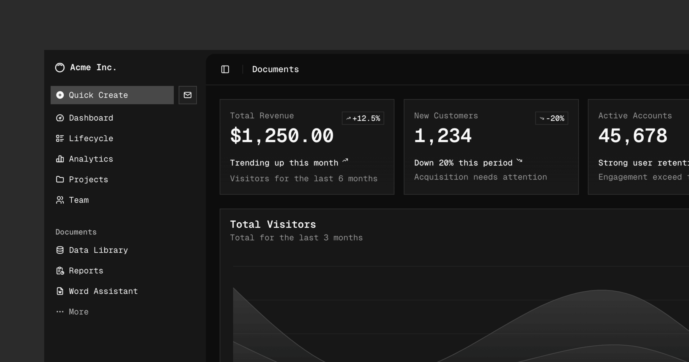
A set of beautifully-designed, accessible components and a code distribution platform. Works with your favorite frameworks. Open Source. Open Code.
118.7k
Stars
9.5k
Forks
2.1k
Open issues
100+
Contributors



AI Analysis
shadcn/ui is a curated collection of accessible, customizable UI components built on Radix UI primitives and styled with Tailwind CSS, designed to be copied directly into your codebase rather than installed as a dependency. It serves best as a starting foundation for building your own component library in React-based projects (Next.js, Vite, Laravel, etc.), giving developers full ownership of the source code. It is for frontend developers who want high-quality, accessible components they can ...
Inferred from signals mentioned in the README (tests, CI, type safety) — not a review of the actual code.
AI's overall editorial judgment — not an average of the bars above, can weigh other factors too.
shadcn/ui: Copy-paste component library that ships source code directly into your project
shadcn/ui is a collection of accessible, styled UI components built on Radix UI primitives and Tailwind CSS. Unlike traditional component libraries, it distributes source code directly into your codebase via a CLI — you own the code and can modify it freely. Targeted at React/Next.js developers who want production-quality components without being locked into a third-party package's API or update cycle. With 117k stars and active ports across Vue, Svelte, and other frameworks, it has become the de-facto starting point for many modern web UI projects.
Created in January 2023 by @shadcn. Grew explosively in its first year, winning the 2023 JavaScript Rising Star award for UI frameworks. Reached v4 with ongoing feature expansion and broader framework support.
Growth was driven by a genuinely novel distribution model (copy code, don't install a package), the aesthetic quality of defaults, tight Tailwind CSS integration, and viral spread through developer Twitter/X. The model resonated strongly as teams grew frustrated with locked component library APIs. Active ports to Vue and Svelte further amplified reach.
117k GitHub stars represent one of the highest counts for any UI library. Multiple major framework ports (Vue, Svelte) with thousands of stars each confirm cross-ecosystem demand. Widely referenced in developer tutorials, conference talks, and job postings as of 2024-2025. Vercel, the Next.js ecosystem, and numerous SaaS starter kits ship with shadcn/ui by default. Adoption at scale is well-documented across public sources.
Appears to be a monorepo (apps/ directory visible in README) containing documentation site and component registry. Components are likely built on Radix UI primitives for accessibility, styled with Tailwind CSS utility classes, and distributed via a CLI that copies individual component files into the user's project. This 'open code' model means the library itself is not a runtime dependency.
Not documented in README
Last push on 2026-06-19 — one day before the evaluation date — indicates active, continuous maintenance. 554 stars gained in the last 7 days suggests sustained community momentum, not a stagnating project. The presence of a v4 iteration signals deliberate versioned evolution.
ADOPT IF: you are building a React/Next.js or Tailwind-based project and want high-quality accessible components as a starting point that you fully own and can customize without version-lock concerns. AVOID IF: you need a fully managed, versioned design system with guaranteed backward compatibility and centralized theming governance across a large enterprise — copying source into the repo increases long-term maintenance burden at scale. MONITOR IF: you are working in Vue, Svelte, or other frameworks where the official ports are community-maintained and may diverge or fall behind the original.
Independent dimensions
Mainstream potential
9/10
Technical importance
7/10
Adoption evidence
9/10
- Code-ownership model means security patches or upstream Radix UI fixes do not automatically propagate — teams must manually re-sync components.
- Large projects accumulate many copied component files that can diverge significantly from upstream, making future upgrades labor-intensive.
- The aesthetic is opinionated and widely adopted — projects using default shadcn/ui styling may look visually similar to many other apps without deliberate customization effort.
- Framework ports (Vue, Svelte) are community-maintained and may lag behind or become unmaintained if core contributors step back.
- Tailwind CSS is a hard dependency; teams not using Tailwind face a non-trivial integration barrier and would likely find other solutions more suitable.
Likely to remain the dominant Tailwind-based component starting point for the React ecosystem through 2027, with the registry/distribution model potentially influencing how other UI libraries think about code ownership.
Newsletter
Get analyses like this every Monday
Free weekly digest of the most interesting open-source discoveries.
Languages
Information
- Website
- https://ui.shadcn.com
- Language
- TypeScript
- License
- MIT
- Last updated
- 1d ago
- Created
- 43mo ago
- Analyzed with
- anthropic/claude-sonnet-4-6
Stars over time
Contributors over time
Top 100 contributors only — repos with more will plateau at 100.
Open issues
[bug]: `MessageScroller`: mount-time anchors are never registered, so a same-count content swap re-anchors to a stale message
[bug]: `MessageScroller`: a manual scroll during an anchored streaming turn destroys the reserved tail spacer
[bug]: Init preset overwrites font mapping but leaves default GeistSans imported as dead weight
Top contributors
Similar repos

hsuanyi-chou/shadcn-ui-expansions
A collection of production-ready React components built on top of shadcn-ui,...

nolly-studio/cult-ui
Cult/ui is a collection of 92+ copy-paste React components styled with Tailwind...
| Repository | Stars | Week Δ | Language | Score | Updated |
|---|---|---|---|---|---|
|
shadcn-ui/ui
this
|
118.7k | +673 | TypeScript | 9/10 | 1d ago |
|
hsuanyi-chou/shadcn-ui-expansions
|
1.9k | — | TypeScript | 7/10 | 3w ago |
 sadmann7/diceui sadmann7/diceui
|
2k | — | TypeScript | 7/10 | 2w ago |
|
nolly-studio/cult-ui
|
5.8k | — | TypeScript | 7/10 | 2mo ago |
 unovue/shadcn-vue unovue/shadcn-vue
|
10.3k | — | TypeScript | 8/10 | 7h ago |
 mehdibha/dotUI mehdibha/dotUI
|
1.3k | — | TypeScript | 8/10 | 15h ago |
MUI is a traditional npm-installed library with a full design system. shadcn/ui offers more ownership and customizability but requires users to manage the component code themselves. MUI has stronger enterprise design system tooling; shadcn/ui has lighter integration overhead for Tailwind-based projects.
shadcn/ui is built on top of Radix UI primitives. Radix provides unstyled accessible components; shadcn/ui adds the styling layer. They are complementary rather than competing, but developers who want maximum styling control and no defaults may prefer using Radix directly.
Headless UI is also unstyled/lightly styled and Tailwind-friendly, but has a narrower component set and slower release cadence. shadcn/ui offers a broader catalog and a more opinionated visual starting point.
Chakra UI is a full npm-installed React component library with its own style system. It has stronger theming infrastructure but less flexibility for deep customization. shadcn/ui's code-ownership model is preferred by teams who outgrow Chakra's constraints.
Community-maintained ports of shadcn/ui for Vue and Svelte respectively. They follow the same distribution model but lag behind the original in component count and update frequency. Their existence validates the model's cross-framework appeal.