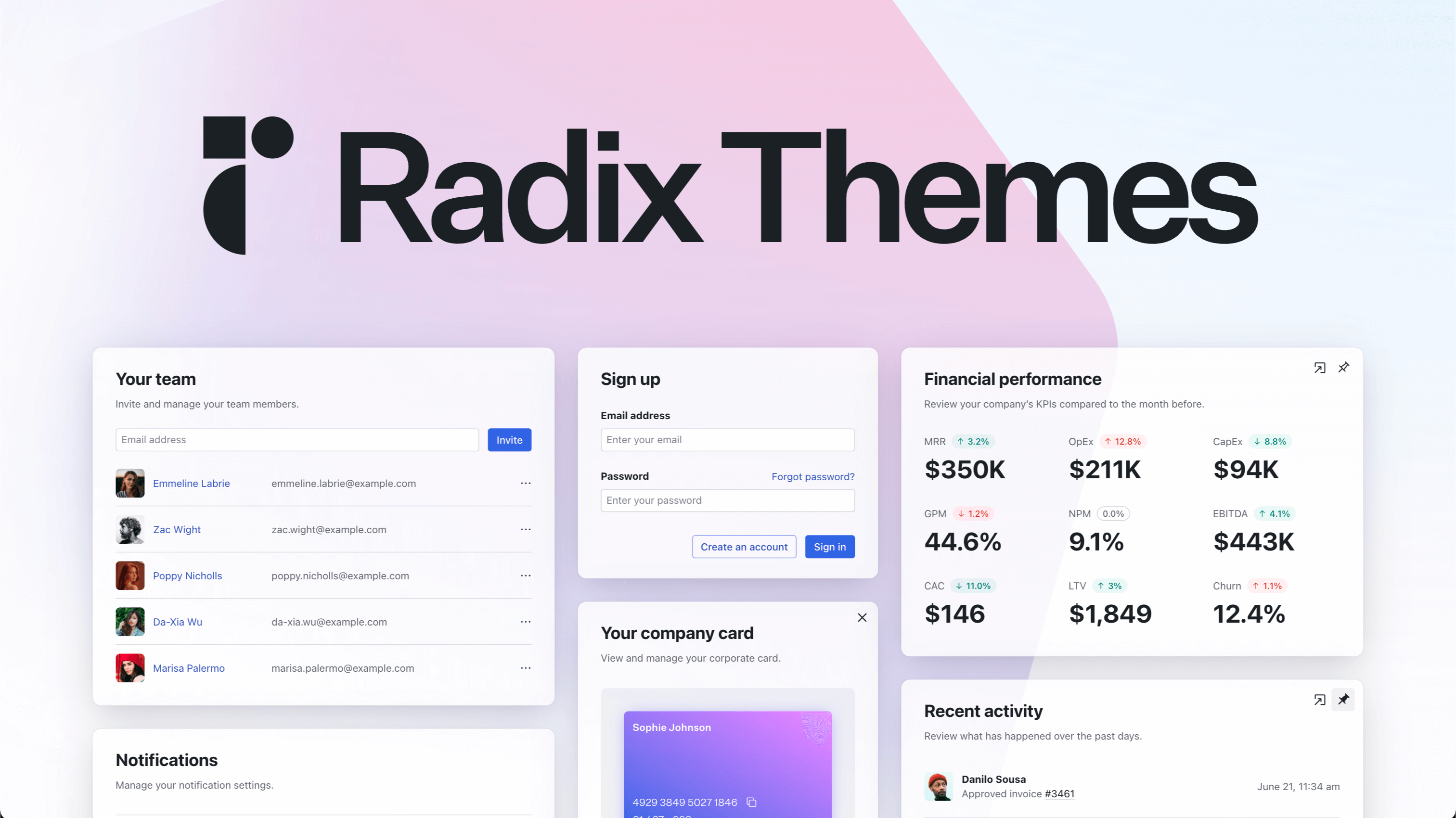
Radix Themes is an open-source component library optimized for fast development, easy maintenance, and accessibility. Maintained by @workos.
8.5k
Stars
329
Forks
160
Open issues
27
Contributors


AI Analysis
Radix Themes is an open-source React component library built on Radix UI primitives, designed for fast development, maintainability, and accessibility-first design. It serves teams and developers building web applications who need pre-built, themeable components with strong accessibility guarantees and design system integration. Best suited for product teams and agencies building modern web interfaces; not ideal for projects requiring highly custom styling or non-React technology stacks.
Inferred from signals mentioned in the README (tests, CI, type safety) — not a review of the actual code.
AI's overall editorial judgment — not an average of the bars above, can weigh other factors too.
Radix Themes: A styled, accessible React component library built on Radix Primitives
Radix Themes provides a complete set of styled, accessible React components built on top of Radix Primitives. Unlike Radix Primitives (which are unstyled), Themes ships with a default visual system — colors, typography, spacing — aimed at teams who want production-ready UI without building a design system from scratch. It targets React developers who value accessibility and want sensible defaults rather than full styling freedom. Maintained by WorkOS, it has a clear commercial backer and a coherent roadmap.
Launched in June 2023 as a logical extension of the Radix Primitives ecosystem. Radix Primitives had strong adoption but required users to bring their own styles; Themes was created to fill that gap and lower the barrier for teams without dedicated design resources.
Initial growth was driven by the existing Radix Primitives community and the broader React accessibility conversation. Growth has been steady but modest — 8,491 stars over roughly 3 years positions it well below shadcn/ui, which occupies significant mindshare in the same space. Weekly star activity (16 in 7 days) indicates slow but continued organic interest rather than viral momentum.
WorkOS uses Radix Themes in its own products, providing at least one verified production user. NPM download counts are not referenced in the README. Community channels (Discord, GitHub Discussions) exist and suggest active user engagement, but quantified production adoption beyond WorkOS is not documented in available metadata.
Likely a TypeScript component library that wraps Radix Primitives with a CSS-based theming system. The README references a theme-level configuration (colors, radius, scaling) and suggests CSS custom properties are likely used for theming. Appears to follow a compound component pattern consistent with Radix Primitives conventions.
Not documented in README.
Last push was April 11, 2026 — approximately 10 weeks before the current date. This indicates active but not highly frequent maintenance. WorkOS backing provides organizational stability. 328 forks suggest moderate external engagement. The project is not stagnant but releases appear to be periodic rather than continuous.
ADOPT IF: your team wants accessible, pre-styled React components with minimal design system setup, trusts the Radix/WorkOS maintenance track record, and doesn't need the full ownership model that shadcn/ui provides. AVOID IF: you need deep visual customization freedom, prefer the copy-paste ownership model, or are already heavily invested in shadcn/ui or MUI. MONITOR IF: you're evaluating whether WorkOS's stewardship will continue to prioritize open-source investment or shift focus to commercial product needs.
Independent dimensions
Mainstream potential
4/10
Technical importance
7/10
Adoption evidence
4/10
- shadcn/ui has captured the dominant position in styled Radix-based component libraries and may continue to absorb new developer mindshare, limiting Radix Themes' growth ceiling.
- The installed-dependency model means breaking changes affect all users simultaneously, which can create upgrade friction for production teams.
- WorkOS is the primary maintainer — if WorkOS's business priorities shift, open-source maintenance cadence may slow without community capacity to compensate.
- The theming system's flexibility limits are not clearly documented in available metadata; teams with complex design requirements may hit constraints that require workarounds.
- Low weekly star velocity (16/week) suggests organic discovery has plateaued; without a major adoption event or ecosystem shift, growth may remain slow.
Radix Themes will likely maintain a stable, focused niche as the 'official' styled layer for the Radix ecosystem, but is unlikely to close the mindshare gap with shadcn/ui. Continued WorkOS backing should prevent abandonment.
Explore similar
Newsletter
Get analyses like this every Monday
Free weekly digest of the most interesting open-source discoveries.
Languages
Information
- Website
- https://radix-ui.com/themes
- Language
- TypeScript
- License
- MIT
- Last updated
- 3mo ago
- Created
- 37mo ago
- Analyzed with
- anthropic/claude-haiku-4-5
Stars over time
Contributors over time
Top 100 contributors only — repos with more will plateau at 100.
Open issues
[DropdownMenu] Issue
Hope a Autocomplete component
Dropdown should automatically change value on arrow up/down
When i double click tooltip content, element in clipboard is double
CSS files need to pass `noUncheckedSideEffectImports` after TypeScript 7.0 (tsgo)
Top contributors
Recent releases
Similar repos
radix-ui/primitives
Radix Primitives is an open-source, low-level UI component library focused on...
| Repository | Stars | Week Δ | Language | Score | Updated |
|---|---|---|---|---|---|
|
radix-ui/themes
this
|
8.5k | +17 | TypeScript | 8/10 | 3mo ago |
|
radix-ui/primitives
|
19k | — | TypeScript | 8/10 | 12h ago |
|
radix-ui/website
|
1k | — | TypeScript | 8/10 | 1w ago |
 system-ui/theme-ui system-ui/theme-ui
|
5.4k | — | TypeScript | 8/10 | 4w ago |
 shadcn-ui/ui shadcn-ui/ui
|
118.7k | — | TypeScript | 9/10 | 1d ago |
 mui/base-ui mui/base-ui
|
10.3k | — | TypeScript | 8/10 | 7h ago |
shadcn/ui dominates mindshare in the styled-Radix-Primitives space with 117k+ stars. It takes a copy-paste-into-your-project approach, giving developers full ownership of component code. Radix Themes is a traditional installed dependency, which trades flexibility for convenience. The two can coexist philosophically but compete for the same React developer audience.
The parent project. Primitives are intentionally unstyled and require the developer to add styles; Themes solves that for teams who want defaults. They are complementary, not competing — Themes is built on Primitives.
MUI Base UI also offers unstyled primitives with accessibility focus. It comes from the MUI ecosystem and targets teams already familiar with MUI conventions. Radix Themes offers a more opinionated out-of-the-box visual system.
Theme UI is an older design-constraint library focused on theme specification. It has lower recent momentum (5,405 stars) and appears less actively maintained relative to Radix Themes. Different conceptual approach — Theme UI is constraint-based, Radix Themes is component-based.
Reka UI targets Vue rather than React, so it is not a direct competitor. Both address the accessible primitives problem in their respective ecosystems.